Mercedes-Benz Logo: The Timeless Three-Pointed Star Icon’s Evolution
Giancarlo Perlas March 11, 2023The Mercedes-Benz logo is easily one of the most recognizable symbols in the automotive industry. The emblem is known for its sleek and elegant design, which has evolved over the years.
The iconic three-pointed star has become synonymous with the Mercedes brand and its luxurious cars. In this article, we will take a look at the evolution of the Mercedes-Benz logo and how it has changed over time.
1900s

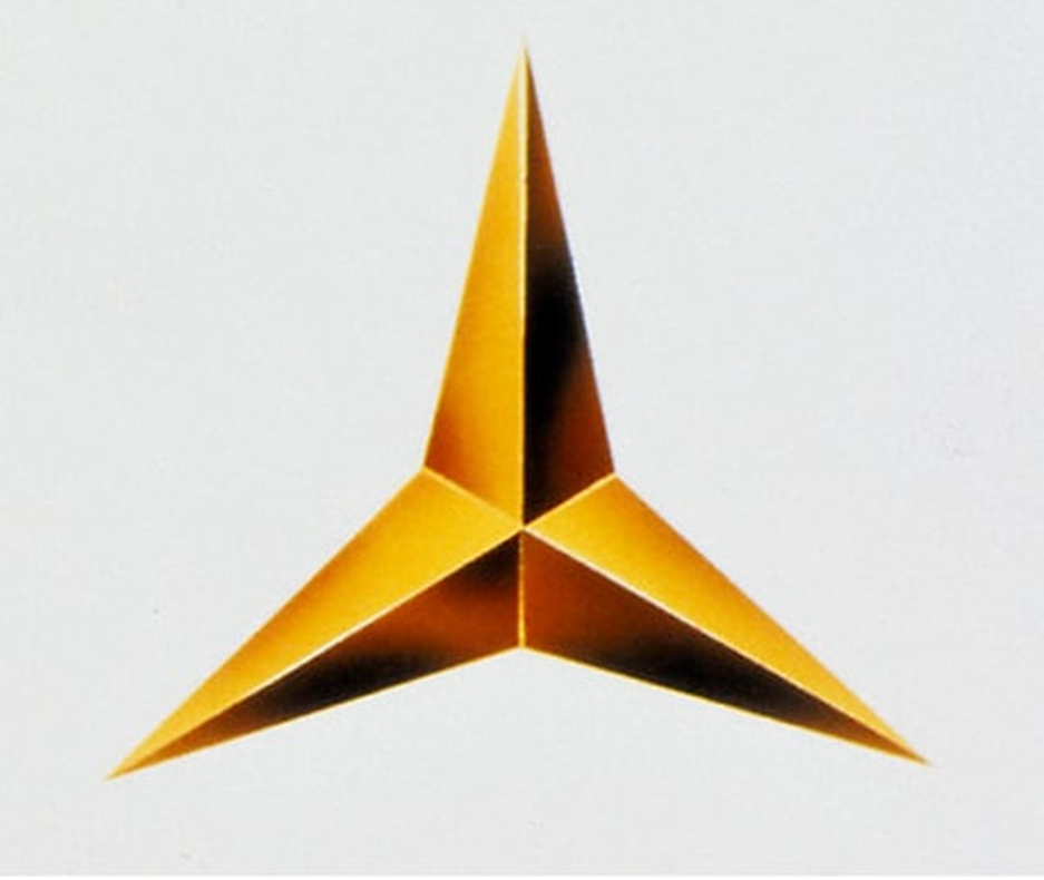
The Mercedes-Benz logo was initially used by Gottlieb Daimler to mark his family’s house on a postcard featuring a scenery of the town of Deutz while he was serving as the technical director of Gasmotorenfabrik Deutz. Following his death, his sons Paul and Adolf Daimler modified and trademarked it in 1909 to be used as their company’s official logo.
Another prototype of the symbol featured a simple star with four points. However, it was eventually dropped and was later adopted by the European Aeronautic Defence and Space Company (EADS) as its logo in the 1980s.
The original logo was designed by Benz & Cie in the form of a three-pointed golden star. The three points represented the company’s ability to manufacture engines for land, sea, and air. An alternate blue emblem printed with “Benz” and adorned by laurel leaves side by side was also used in 1909.
1916 to 1926

The year 1916 marked the transition of the symbol to include a black circular rim embedded with four smaller three-pointed stars and a “Mercedes” label. Later on, the iconic logo was revised in 1926 when a new one was introduced to celebrate the birth of the Mercedes-Benz brand under the Daimler-Benz company.

The next logo showed a combination of the previous ones, with a three-pointed star inside a laurel wreath and in front of a bluish background. The laurel wreath represented the company’s success and achievements, and the three-pointed star remained to represent the company’s ability to manufacture engines for land, sea, and air.
1930s

In 1933, the sign was streamlined into a sleeker design with a streamlined black three-pointed star inside a black circle. Then, in 1934, a silver variant was unveiled to highlight the company’s motorsport involvement. It was also during this time that the race cars of the marque were beginning to be referred to as the “Silver Arrows”.
1952

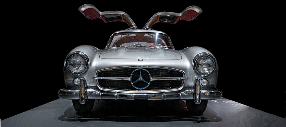
In 1952, the logo underwent a minor revision to offer a bolder look and was integrated into the front radiator grille. The new logo possessed a simpler design with a three-pointed star inside a circle without any additional embellishments. The first to feature this was the 300 SL (W194) race and production cars.
1989

By 1989, the design changed to provide a better three-dimensional look to go with the times. It featured a more stylized design with a smaller three-pointed star inside a circle showcasing a more glossy, dynamic, and modern appeal. When used in print or in media, it came with a “Mercedes-Benz” inscription that utilized a serif font.
2011 Up to the Present

Finally, Mercedes altered its logo in 2011 with a lighter shade of gray but with a deeper highlight to the wordmark to give it a firmer tone. This is the mark that the company uses to date.
Conclusion
The Mercedes-Benz logo has undergone several changes over the years, but it has always retained its iconic three-pointed star. The logo has evolved to reflect the company’s success and achievements, and it continues to represent the luxury and elegance of the Mercedes brand.
The Mercedes-Benz logo is a timeless symbol of quality and innovation, and it will undoubtedly continue to evolve as the company grows and evolves.


